
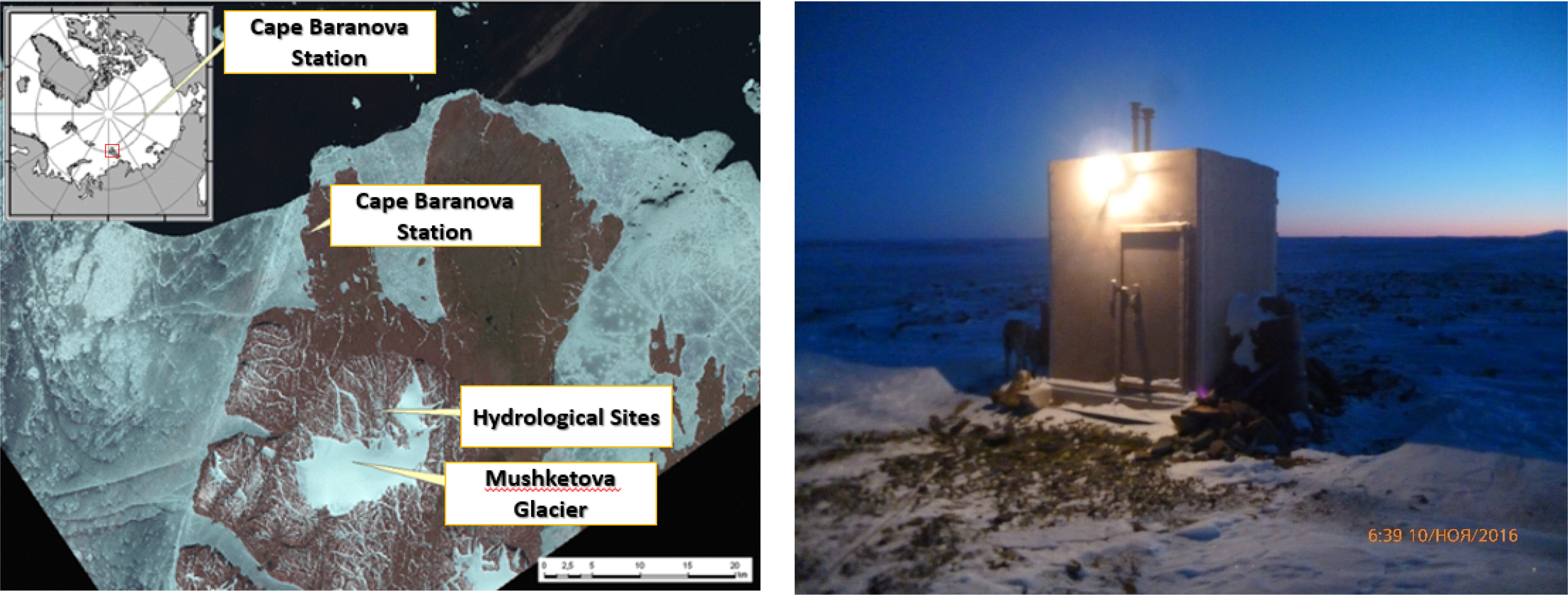
Fig. 1.
Geographical location of «Ice Base Cape Baranova station» on the Bolshevik Island (http://globalcryospherewatch.org) (left panel), and aerosol pavilion (right panel).
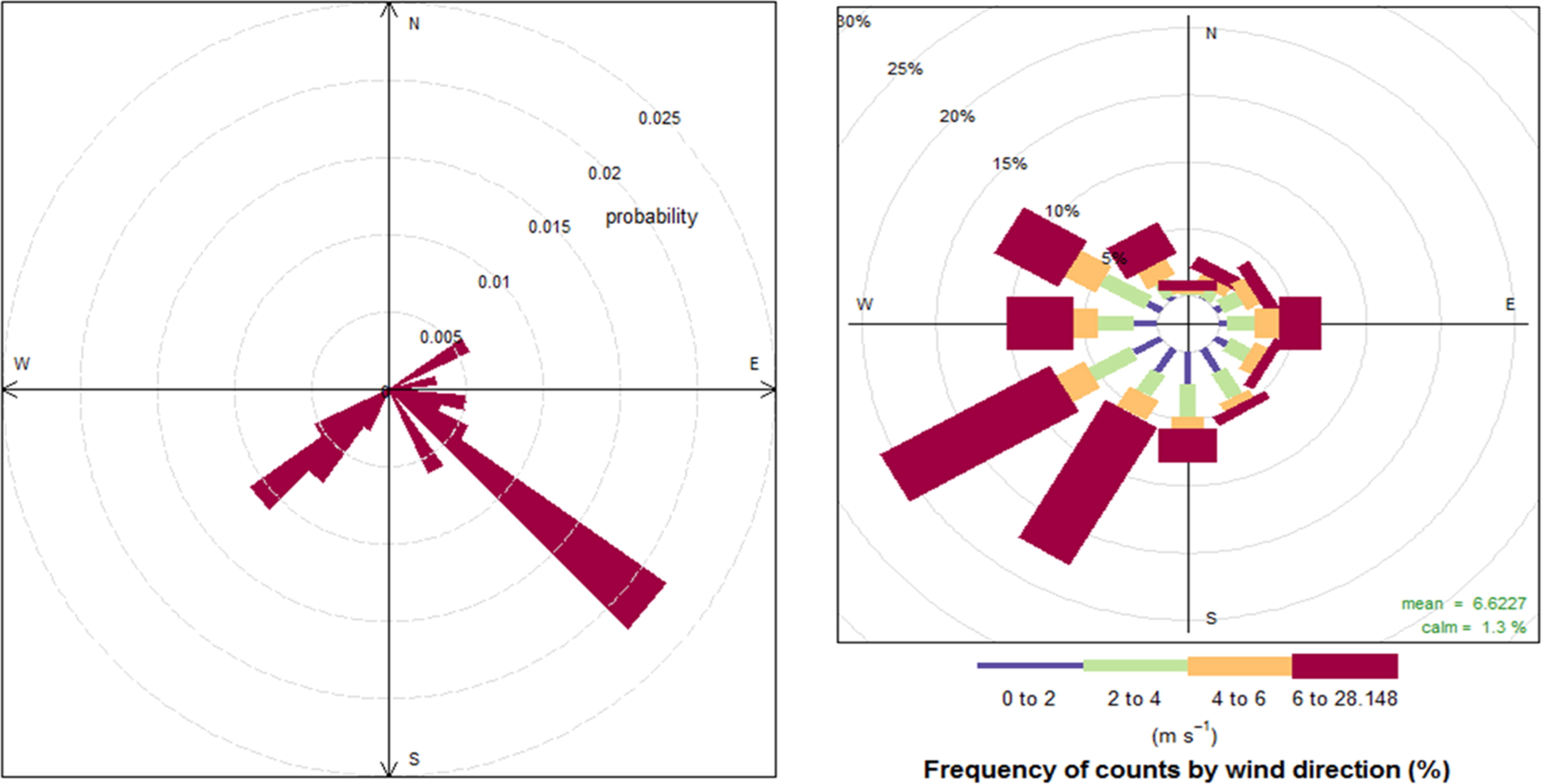
Fig. 2.
Left: CPF for the 95th percentile for EC. Right: Wind rose for the study period.
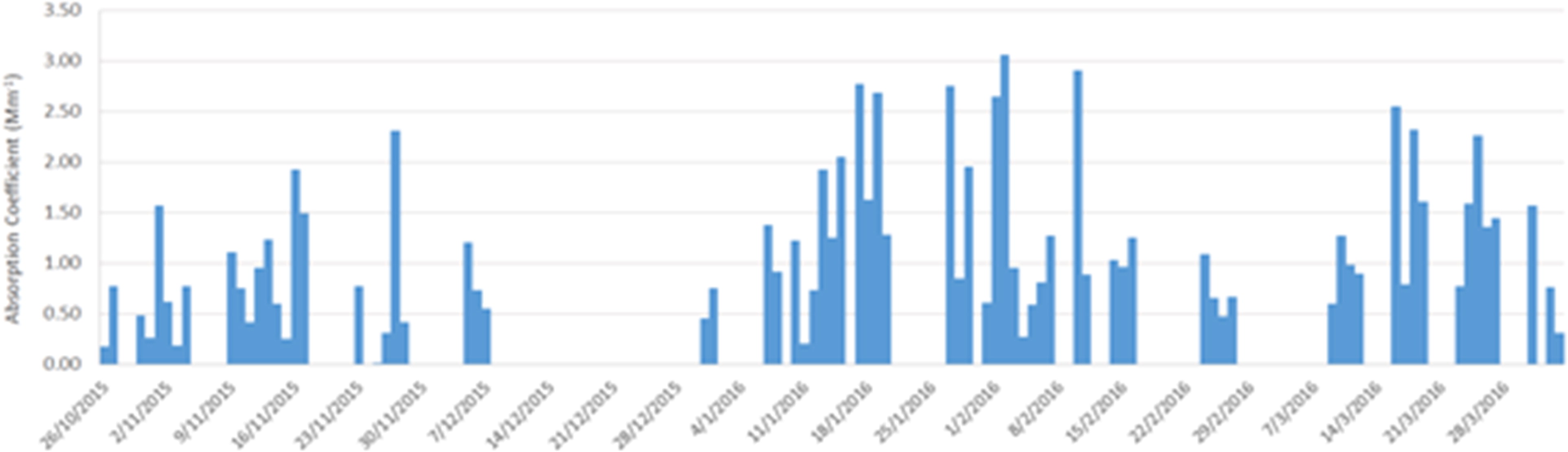
Fig. 3.
Time series of 3 h average aerosol Absorption coefficient (Mm−1) at the wavelength of 650 nm.
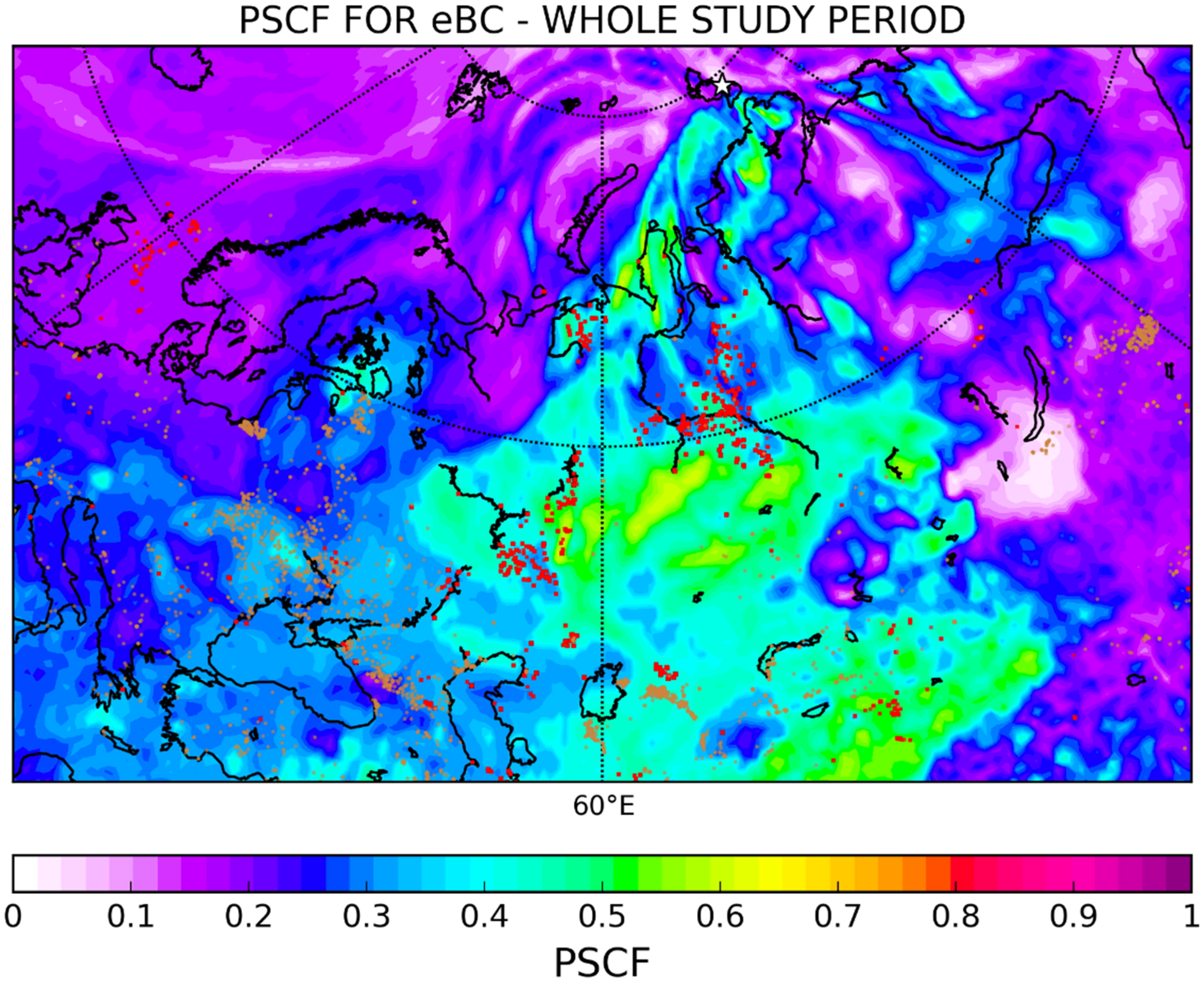
Fig. 4.
PSCF analysis for eBC. The red dots in the map represent the gas flaring regions from the Global Gas Flaring Reduction Partnership (GGFR), http://www.worldbank.org/en/programs/gasflaringreduction) while the brown dots represent active fires from MODIS (Giglio et al., 2003).
Table 1.
Descriptive statistics (average, stdev, min, max) for EC and OC in ng/m3 per season (Winter: Dec-Feb, Spring: Mar-May, Summer: Jun-Aug, Autumn: Sep-Nov).
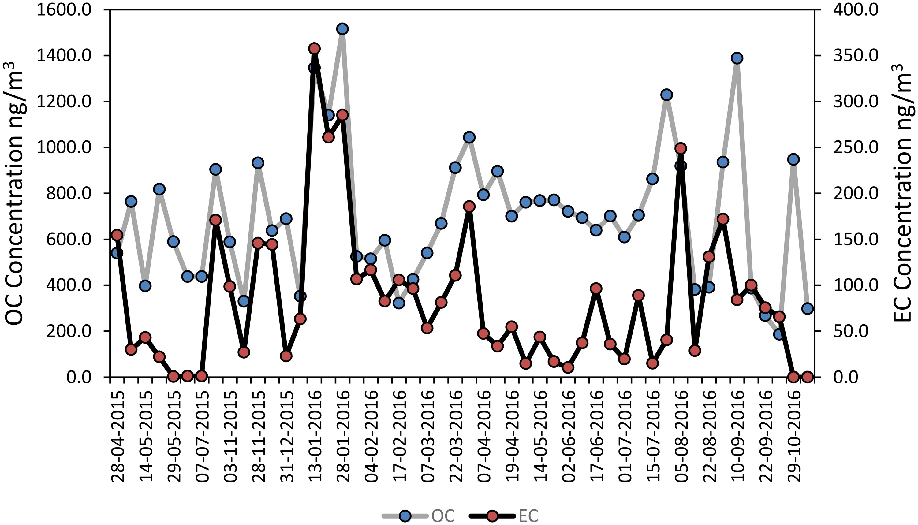
Fig. 5.
Time series of EC and OC in ng/m3 (EC correspond to secondary axis).
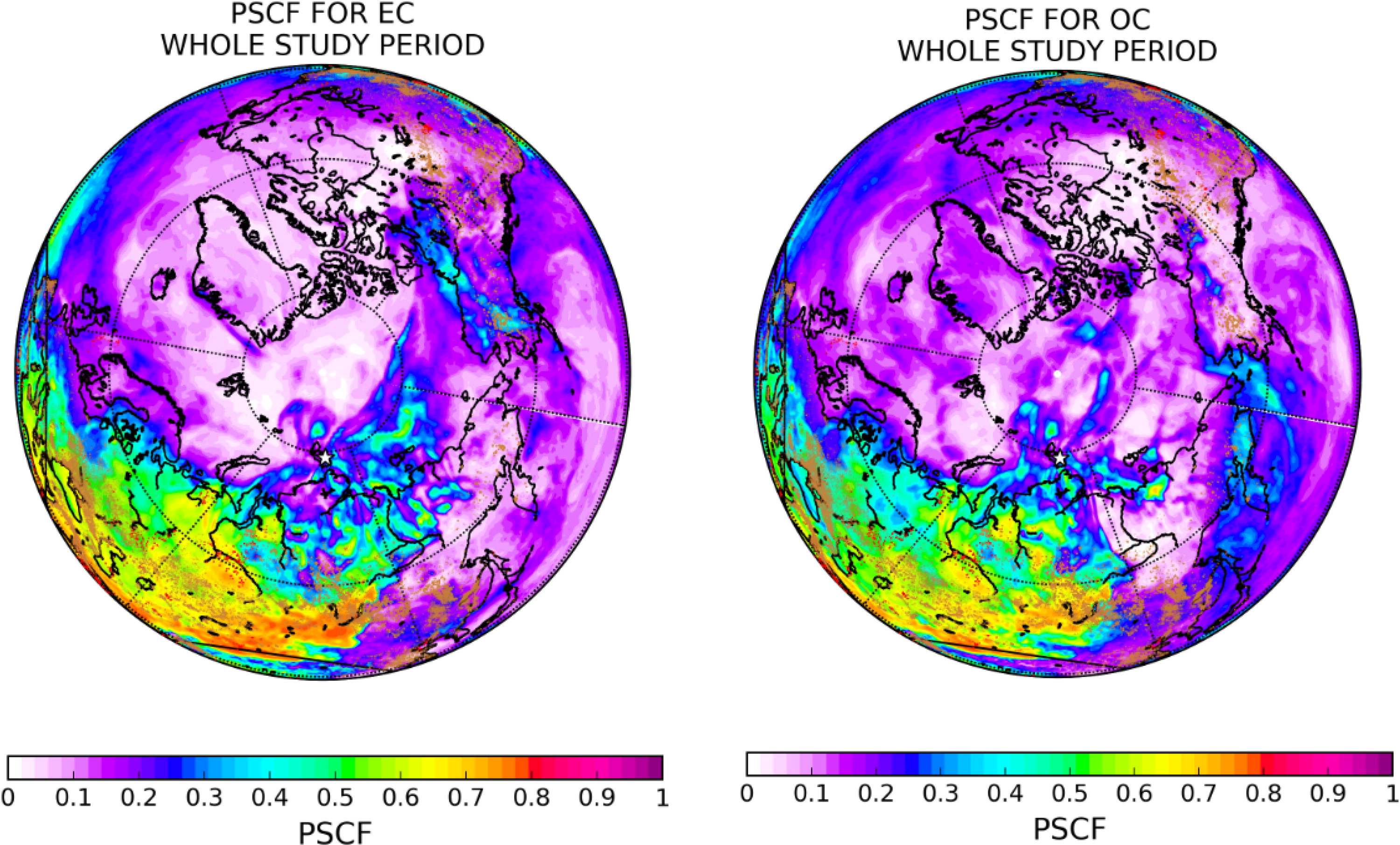
Fig. 6.
PSCF analysis for EC and OC. The red dots in the map represent the gas flaring regions from (Global Gas Flaring Reduction Partnership (GGFR), http://www.worldbank.org/en/programs/gasflaringreduction) while the brown dots represent active forest fires from MODIS (Giglio et al., 2003).
Table 2.
Average concentrations ± standard deviation of measured PM components (ions and elements) in ng/m3 from April 2015 to December 2016 (Warm: summer, Cold: winter, spring).
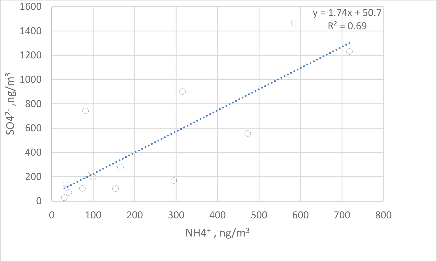
Fig. 7.
Correlation between nss-ncrSO4 2- and NH4 + for the cold season.
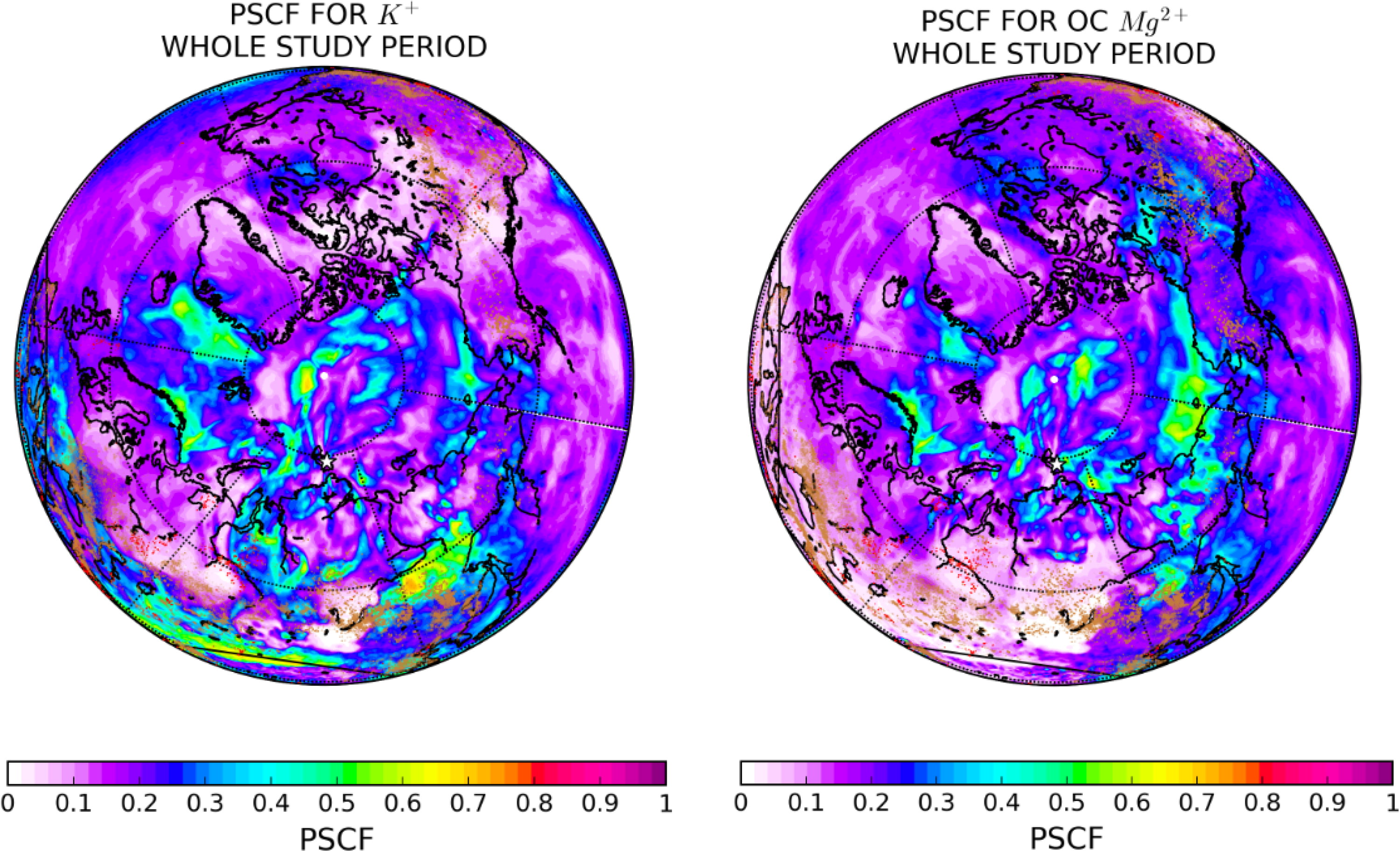
Fig. 8.
PSCF analysis for K+, Mg2+, SO4 2- and NH4 +. The red dots in the map represent the gas flaring regions from (Global Gas Flaring Reduction Partnership (GGFR), http://www.worldbank.org/en/programs/gasflaringreduction) while the brown dots represent active forest fires from MODIS (Giglio et al., 2003).