
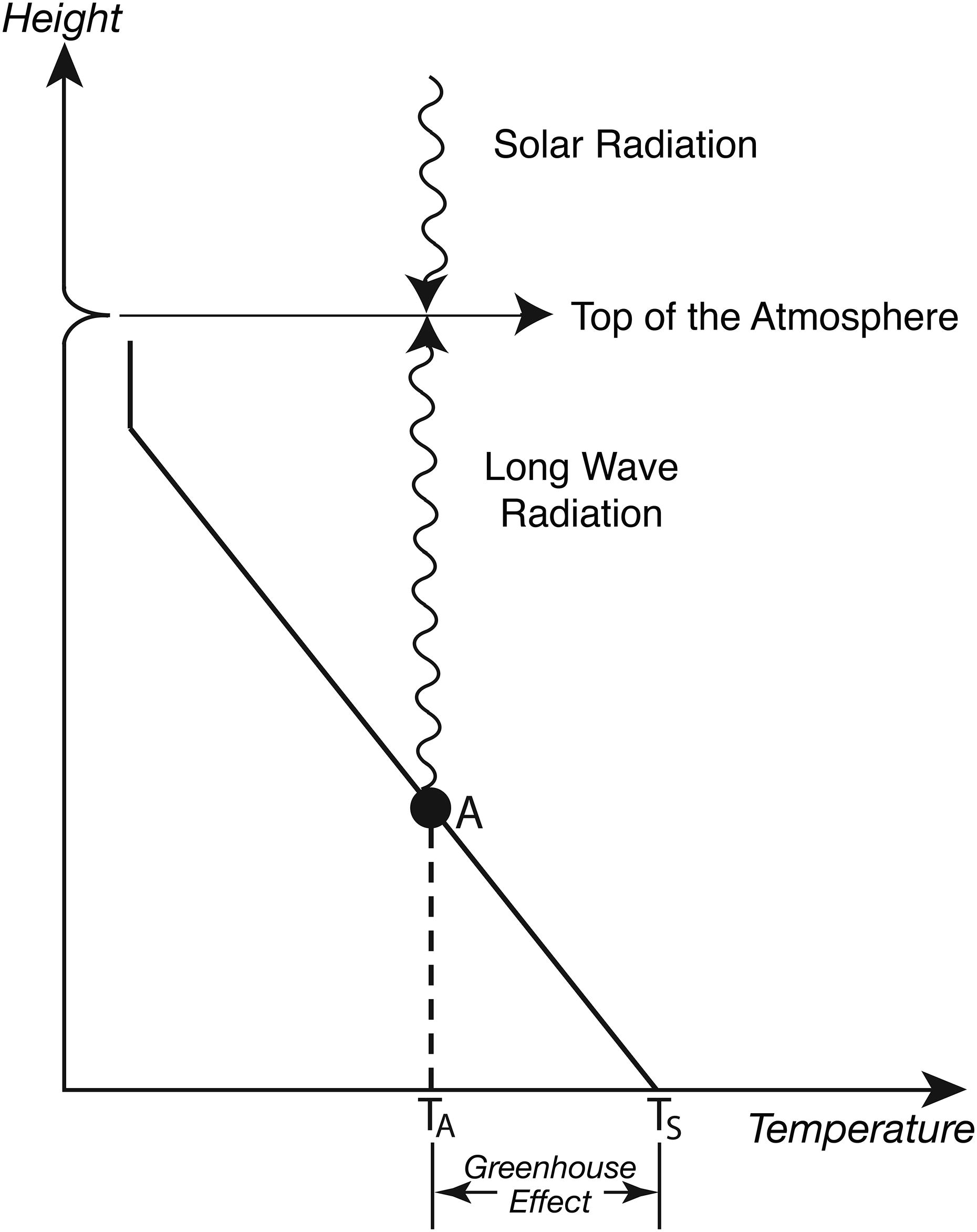
Fig. 1.
Schematic diagram that illustrates the greenhouse effect of the atmosphere. The slanted solid line indicates schematically the vertical temperature profile of the troposphere. The vertical line segment at the top of the slanted line indicates schematically the almost isothermal temperature profile of the stratosphere. The dot A (●) on the slanted line indicates the average height of the layer of emission for the outgoing terrestrial, longwave radiation from the top of the atmosphere. The difference between the global mean surface temperature (TS) and the temperature of the planetary emission (TA) indicates the greenhouse effect of the atmosphere.
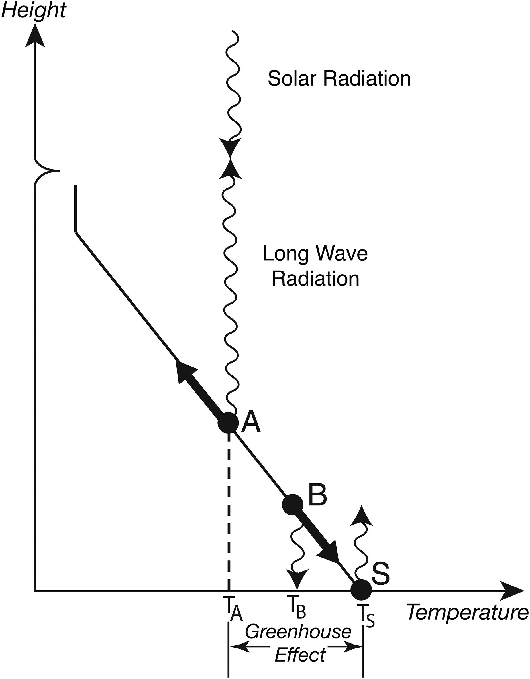
Fig. 2.
Schematic diagram illustrates the upward shift of the dot A (●), which indicates the average height of the layer of the planetary emission for the top-of-the-atmosphere flux of outgoing, longwave radiation, in response to the increase in the concentration of a greenhouse gas in the atmosphere. The diagram also illustrates the downward shift of the dot B (●), which indicates the average height of the layer of emission for the downward flux of the longwave radiation at the Earth surface, in response to the increase in the concentration of a greenhouse gas. Here, the slanted, solid line indicates schematically the vertical temperature profile of the troposphere. The vertical line on the top of slanted line indicate schematically the lower end of almost isothermal stratosphere.
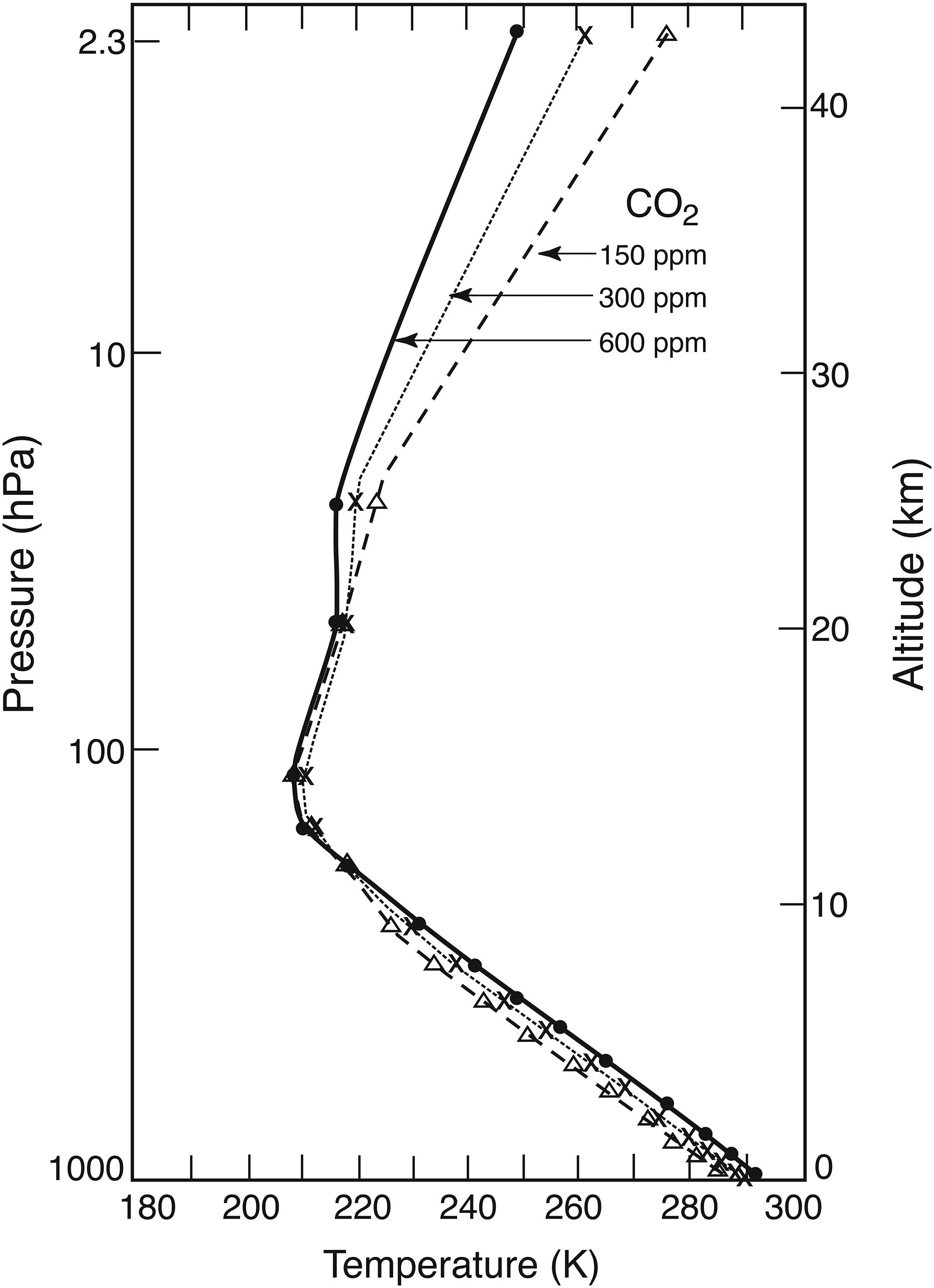
Fig. 3.
Vertical profiles of temperature in radiative-convective equilibrium. Dashed, dotted and solid lines illustrate the vertical profiles obtained for the three different atmospheric concentrations of carbon dioxide, that is, 150 ppm (part per million), 300 ppm, and 600 ppm by volume, respectively. Temperature is indicated at the bottom of the figure. Pressure (hp) and approximate height (km) are indicated on the left and right of the figure, respectively. From Manabe and Wetherald (1967).
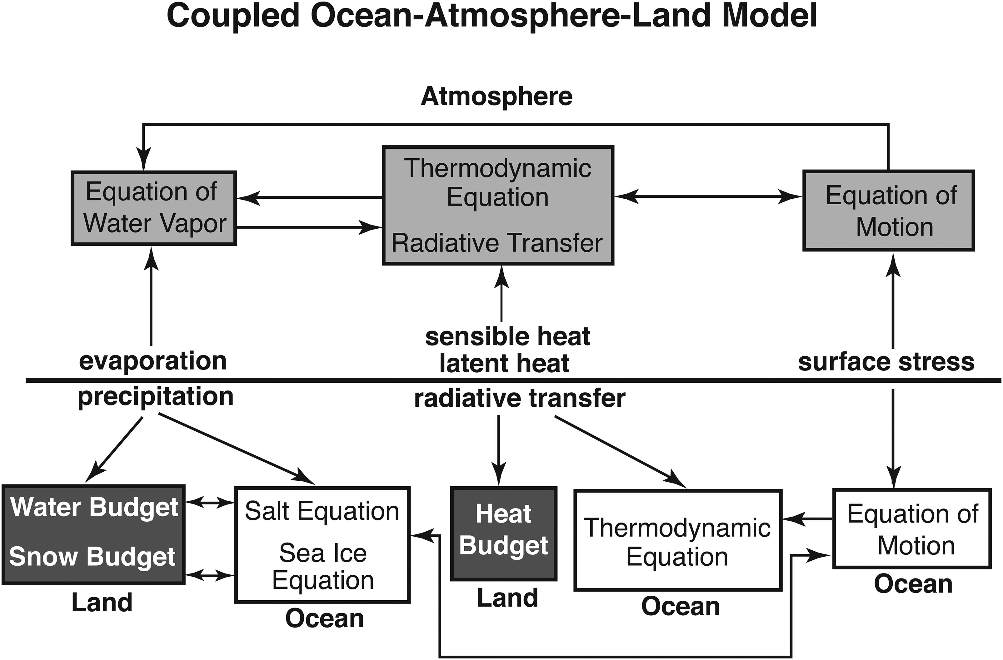
Fig. 4.
Diagram that depicts schematically the structure of the coupled atmosphere-ocean-land model.
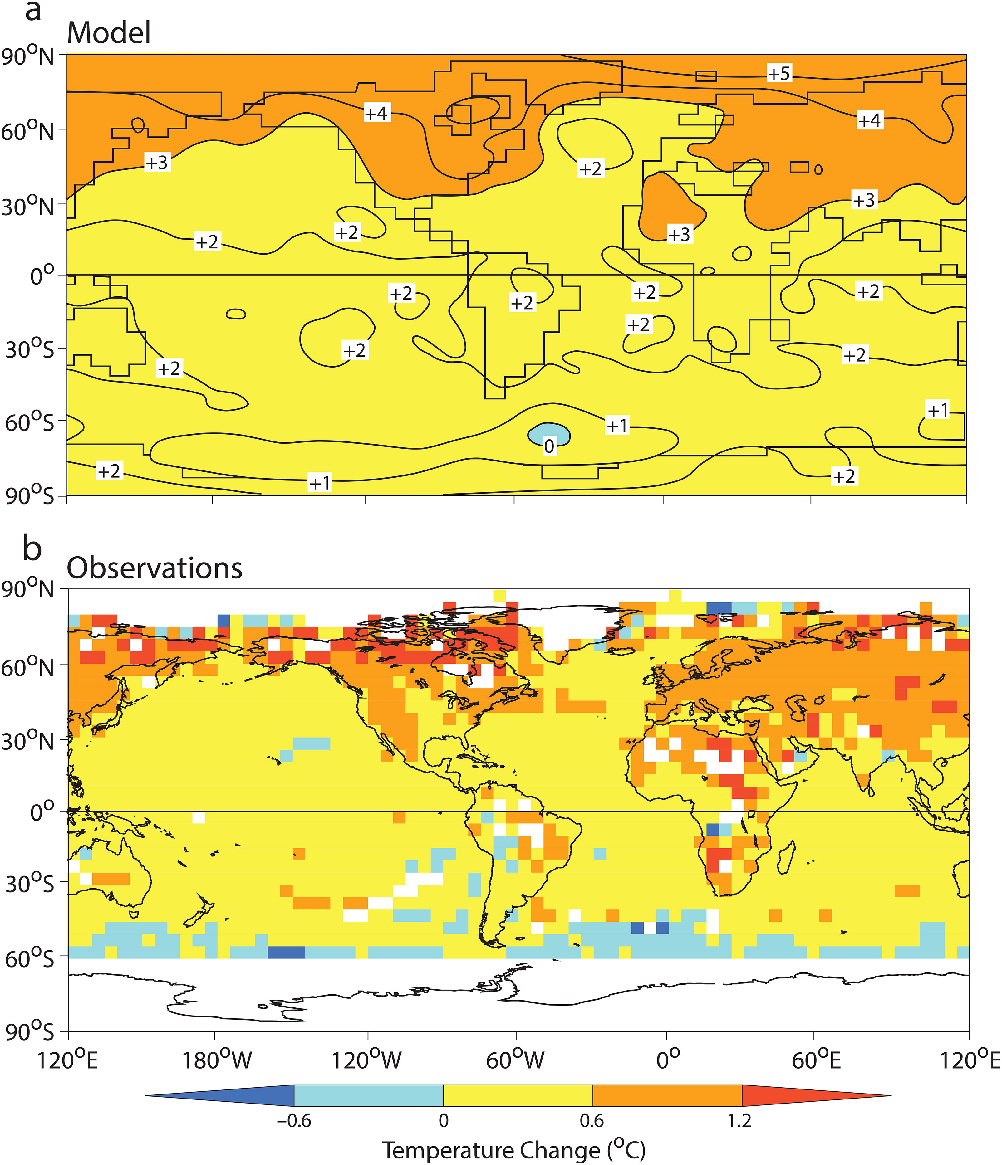
Fig. 5.
Geographical distribution of the change in surface air temperature. (a) Change in the coupled model realised by the ∼70th year (the average between the 60th and 80th year) of the global warming experiment, when the atmospheric concentration of carbon dioxide doubles. Here, surface air temperature is obtained from the atmospheric model level closest to Earth’s surface (∼75 m). (b) Observed change from the 30-year base period around 1975 (1961–1990) to the 25-year period around 2002 (1991–2015). The map is obtained using the historical surface temperature data set HadCRUTS4 described by Morice et al. (2012). Note that, in the Southern Ocean poleward of 60°S, the observed change is not shown because data are hardly available in winter. From Stouffer and Manabe (2017).
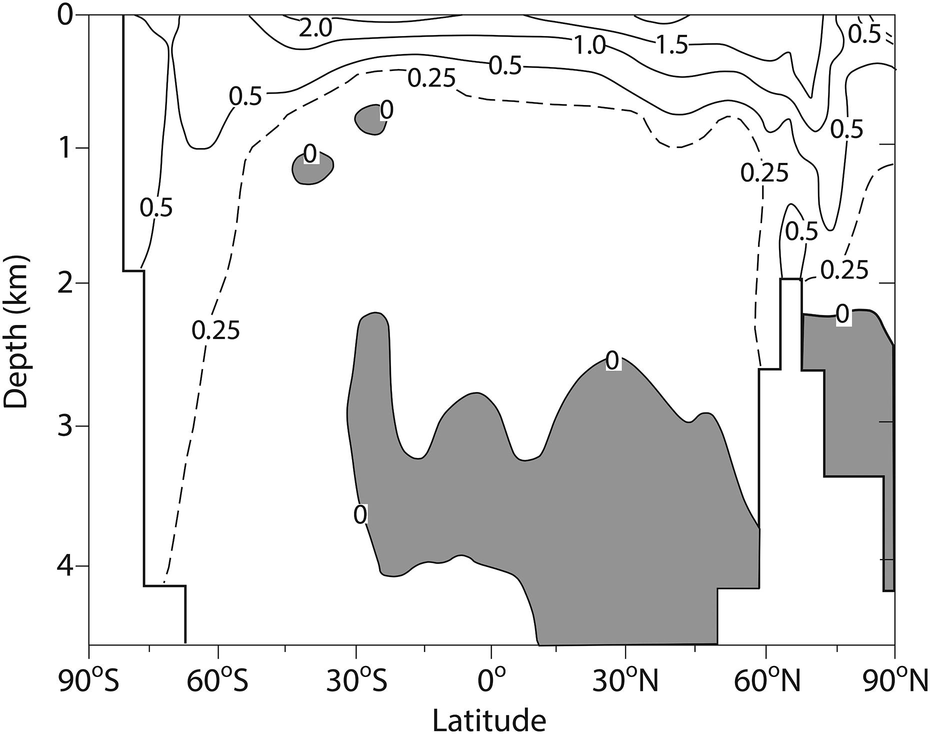
Fig. 6.
Zonally averaged temperature change (°C) for the entire ocean of the coupled model realised by the ∼70th year of the global warming experiment, when the atmospheric concentration of carbon dioxide doubles. From Stouffer et al. (1989).
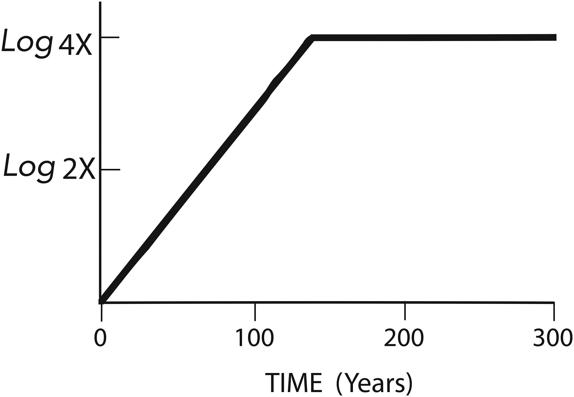
Fig. 7.
Time series of atmospheric CO2 concentration (in logarithmic scale). Here, X and 4X denote 300 ppm by volume and 1200 ppm by volume, respectively.
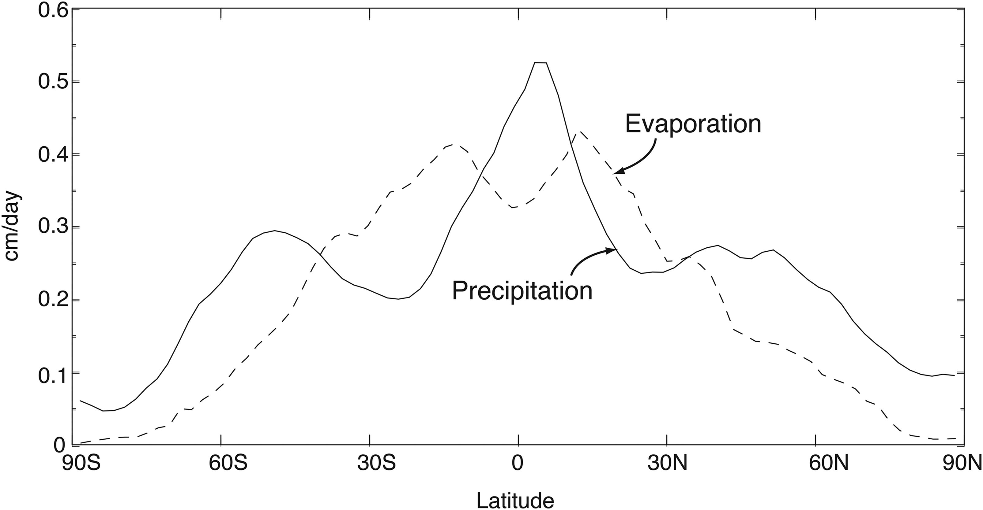
Fig. 8.
Latitudinal profiles of annual mean rate of evaporation (dashed line) and that of precipitation (solid line), zonally averaged over latitude circle. They are obtained from the control run, in which CO2 concentration is held fixed at the standard value (i.e. 300 ppm by volume). From Wetherald and Manabe (2002).
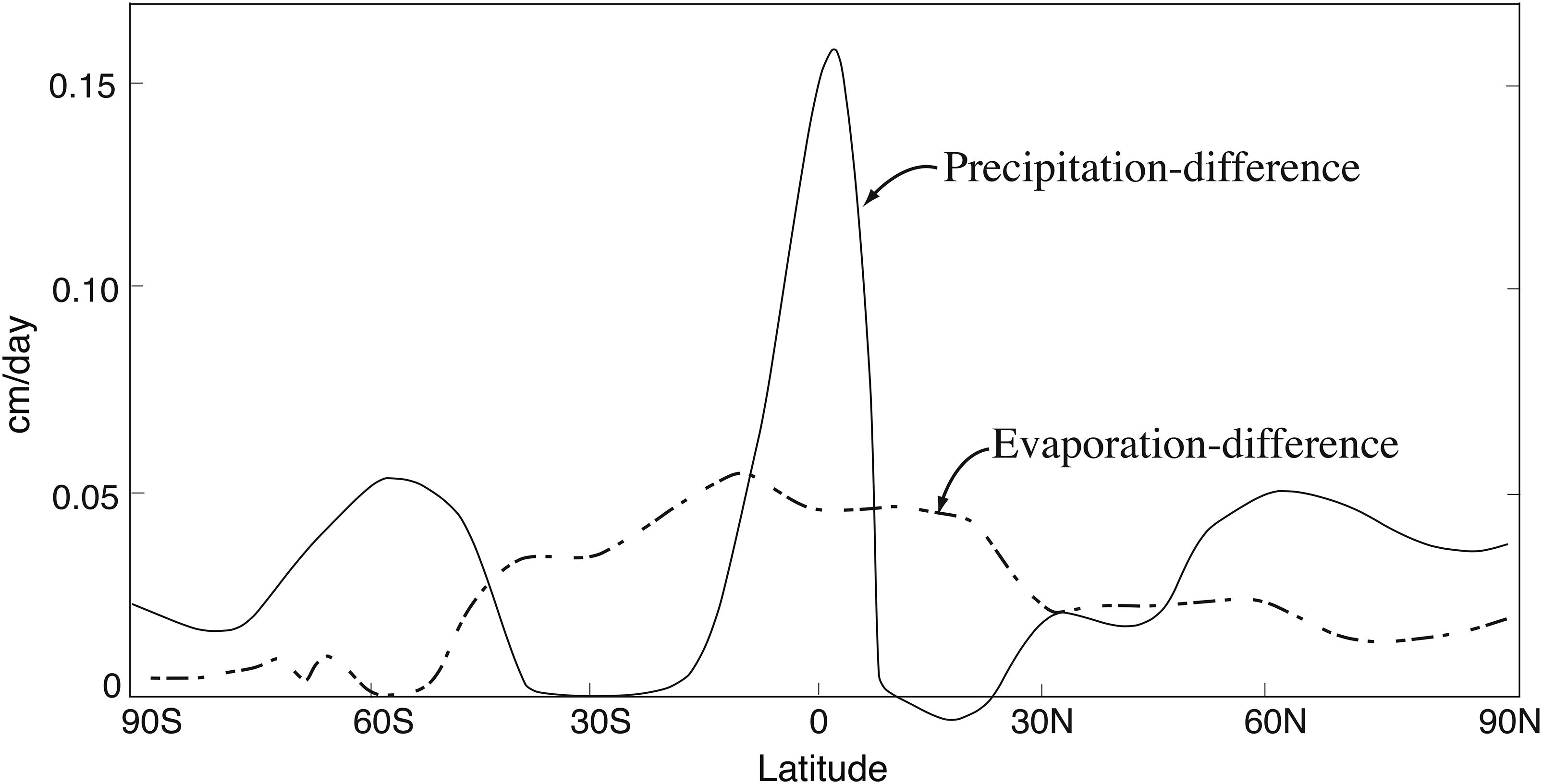
Fig. 9.
Latitudinal profiles of zonally averaged change in the annual mean rates of evaporation and precipitation in response to quadrupling of atmospheric concentration of carbon dioxide.
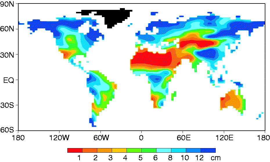
Fig. 10.
Geographical distribution of annual mean soil moisture (cm) obtained from the control run. Here, soil moisture is defined as the difference between the total amount and the wilting point of water in the root zone of soil. From Wetherald and Manabe (2002).
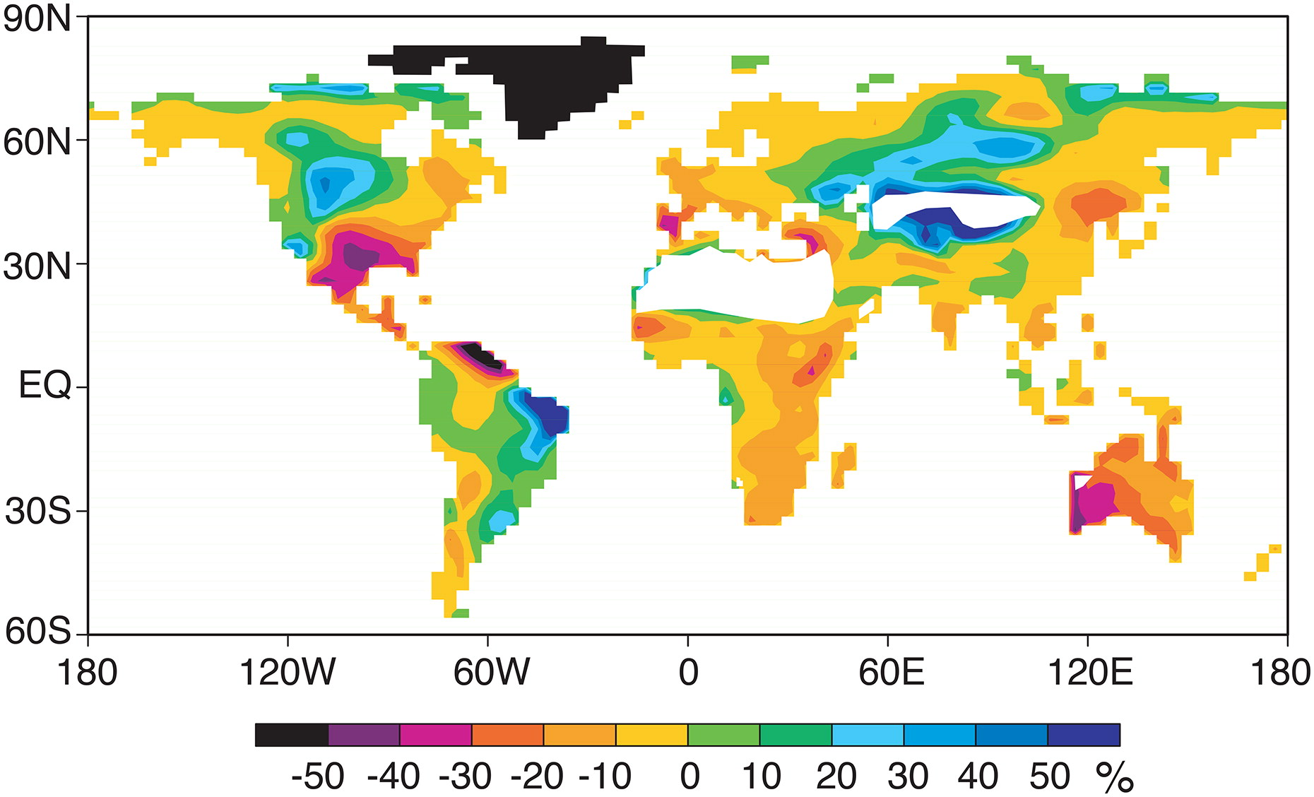
Fig. 11.
Geographical distributions of the percentage change in annual mean soil moisture in response to quadrupling in the atmospheric concentration of carbon dioxide. Here, the percentage change is defined as the percentage of the time mean soil moisture obtained from the control experiment. It is not shown in the extremely arid regions such as Sahara and Central Asia, where soil moisture is less than 1 cm as shown in Fig. 10. In these regions, soil moisture is so small that its percentage change is indefinite. From Manabe et al. (2004b).